A document has been submitted, but nobody can find it. An application is getting slower, yet the cause is unclear. IT teams search through logs while colleagues wait for an answer and unfinished work starts to accumulate.
Monitoring dashboards give companies a shared view of what is happening across their systems. They help teams find delays, investigate failures and understand whether business processes are running as expected. Combined with properly configured alerts, they also help bring problems to the right people's attention without relying on someone watching a screen.
At RNX, we build monitoring solutions around these everyday operational questions, using Elasticsearch, Kibana and New Relic to connect technical data with business needs.
What Is a Monitoring Dashboard
A monitoring dashboard brings selected information from applications, servers and business processes into one visual view. Charts show changes over time, key figures summarize the current situation, and tables provide the detail needed to investigate an issue. The information comes from sources such as system logs, application events and infrastructure metrics.
For a company processing large volumes of documents, that view might show how many files have been received, how many are waiting, which transfers have failed and how long processing takes. For IT support, it can also reveal database delays, stalled processing tasks or unusual network activity.
Its value depends on the questions it answers. A useful dashboard helps someone decide where to investigate, which problem needs attention or whether more capacity may be needed.
Finding Delayed Documents and Interrupted Workflows
Business processes often cross several systems. A document may be scanned, transferred, signed, archived and emailed, with each step leaving records in a different place. When it fails to arrive, manually reconstructing that journey takes time and can involve several teams.
End-to-end monitoring connects those records so support teams can trace document processing across the steps captured in the logs. They can investigate where a document stopped, examine processing errors and compare activity across subsidiaries or folders. This gives colleagues a more specific answer about a delayed document and helps IT narrow the search for the cause. The E2E dashboard below brings message volumes, response processing times and recorded errors into one overview.
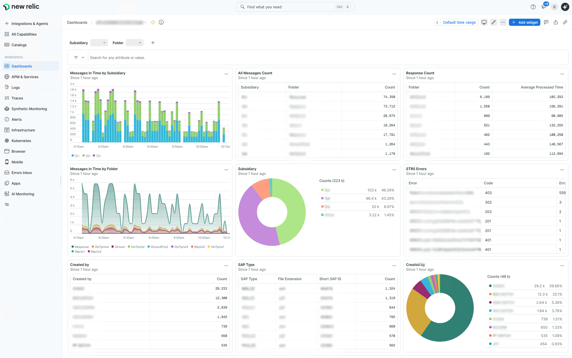
E2E dashboard — Message activity by subsidiary and folder, response counts and processing times help teams narrow down where to investigate a delayed document.
The DP INFO dashboard focuses on Document Pipelines: the queues and processing steps through which documents move. Its latest queue and error counts, together with historical trends, help teams identify backlogs and decide which pipeline to investigate first.
Complementary views add detail: SDF monitoring compares successful and failed document uploads alongside upload times, while DocTool monitoring focuses on recorded processing failures. Together, these views help locate the part of a workflow that needs attention.
Understanding Why an Application Is Slow
Knowing that an application is slow is only the beginning. Teams still need to establish whether the delay comes from database queries, internal queues or another part of processing before choosing a fix.
The Timings dashboard compares frontend and backend processing information, including execution time, SQL time and queue measurements. Function-level tables and time trends help support teams investigate which part of processing contributes to a delay.
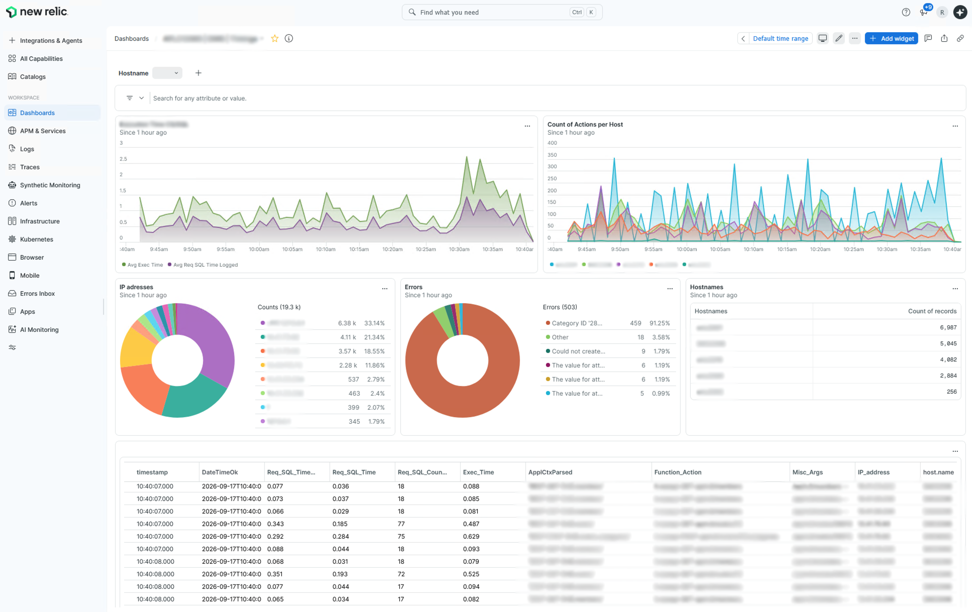
Timings dashboard — Execution, SQL and queue measurements help teams investigate performance bottlenecks before choosing a fix.
Thread Logs provides a complementary diagnostic view of processing activity and recorded stalled or dead threads. Support teams can filter by server, severity or thread and inspect the underlying logs to investigate a specific problem.
This makes investigation more focused. Teams can work from evidence about the affected component and check whether performance improves after a change. For the business, that can mean less time spent waiting for systems and fewer staff hours consumed by troubleshooting.
Planning Capacity and Understanding Resource Use
Dashboards have uses beyond saving time during incident investigation. The same monitoring data can support retrospective evaluation as well as forward-looking planning. Archive statistics show document volumes, sizes, operation types and request times, while historical trends show how workloads develop and where demand is concentrated.
For evaluation, selected dashboards can be used to calculate costs from the number of documents processed. This makes actual resource consumption visible and provides evidence for reviewing how services and shared resources are being used. In an enterprise document management project, accounting and timing data helped make consumption by department visible and supported discussions about shared costs.
The same data also supports capacity planning. Looking at processing volumes, timing and historical trends gives managers a basis for estimating future demand and making decisions about capacity, resources and investment. IT teams can then investigate whether expected growth calls for configuration changes, process improvements or additional resources before capacity becomes a problem.
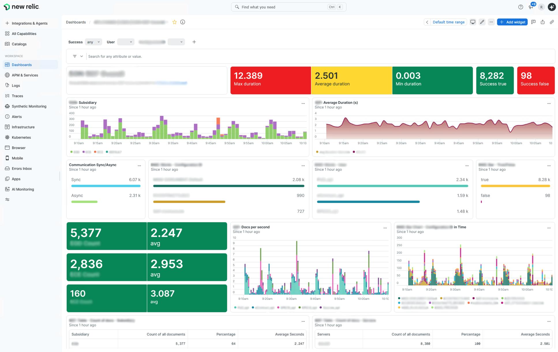
SDF dashboard — Successful and failed document uploads, processing times and subsidiary-level data help teams identify where document processing problems occur.
Using Alert Management to Respond Sooner
A dashboard provides visibility when someone opens it. Automated alerting adds a way to notify the responsible team when a defined condition occurs. Both are valuable, but a colored warning or a threshold line on a chart does not automatically send a notification.
Ports Monitoring provides a concrete example. This solution tracks active network connections and includes alerting for sustained high connection counts. Requiring a threshold breach to persist for a defined period helps distinguish a short spike from a condition that needs investigation. The threshold and duration should reflect the environment and its operational requirements.
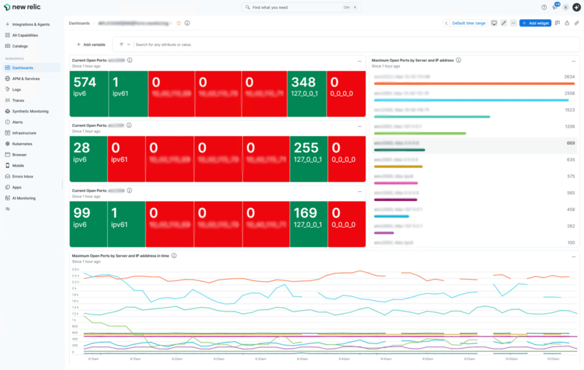
Ports Monitoring dashboard — Current connection counts and historical peaks support network-load investigation. Red tiles indicate zero connections in this view; sustained high-load alerts are configured separately.
In practice, New Relic alerts help teams spot problems before they become visible to users. When a monitored metric crosses a defined threshold or shows unexpected behavior, the relevant team can be notified automatically through email, Slack or an incident management tool. The notification can include the context needed to start investigating immediately, helping teams move from detection to diagnosis without first searching through multiple systems.
Effective alert management therefore involves choosing meaningful conditions, defining ownership and reviewing whether notifications lead to useful action. RNX includes alert noise reduction in its monitoring optimization services. The business benefit is earlier awareness of sustained problems, fewer unnecessary interruptions and a clearer route from detection to response.
How Monitoring Helped Teams in Practice
In one enterprise document management project, teams regularly received requests to locate "lost" documents. Finding an answer meant searching through logs across different systems. With centralized monitoring, they could trace a document through processing steps, identify where it had stopped and explain why it was delayed. This made it easier to investigate problems and give colleagues clear answers.
The benefits extended to incident recovery. In one documented customer example, MTTR was reduced from approximately four hours to 15 minutes. Centralized logs and dashboards helped teams investigate failures and bottlenecks more quickly, reducing the disruption to production.
Routine work also became easier. The same customer example reported savings equivalent to half a full-time role across recurring monitoring, checking and document-related tasks. Automated notifications for scanned documents contributed to these savings, reducing the need for manual checks.
Monitoring also helped resolve discussions about shared costs. By making storage and processing consumption visible by department, teams gained a clearer basis for allocating resources and planning capacity.
These examples show the business value of well-designed monitoring: faster answers, shorter interruptions and less time spent on repetitive checks, giving employees more time for the work that depends on those systems.
Keep Your Business Processes Running
Well-designed dashboards and alerts turn scattered technical data into clear answers: where a document stopped, why an application is slow and how workloads are developing. That is the difference between searching and knowing.
RNX designs and operates monitoring and visualization solutions with Elasticsearch, Kibana and New Relic — tailored to your environment and the questions your teams ask every day.
Book a free consultation to discuss your monitoring needs.